
JInputValidator
An InputVerifier for Java Swing that shows validation state to the right of the validating component.
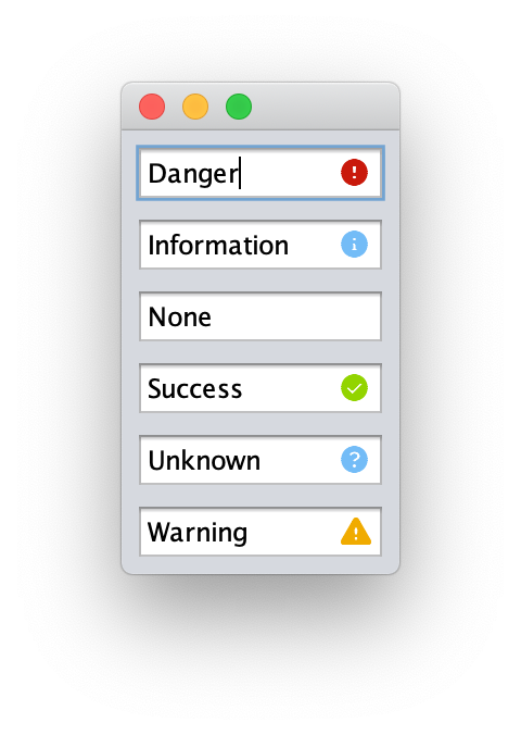
JInputValidator extends the verify idiom to use six states, each with its own graphical representation and tool tip text:
- DANGER, a failure state, which defaults to a red letter X in a circle.
- INFORMATION, a non-failure state, which defaults to a light blue letter i in a circle.
- NONE, the default state, which does not show any icon.
- SUCCESS, a non-failure state, which defaults to a green check mark in a circle.
- UNKNOWN, a non-failure state, which defaults to a light blue question mark in a circle.
- WARNING, a failure state, which defaults to a yellow-orange exclamtion mark in a triangle.
When a status is set to a “failure state” InputVerifier.verify(Component c) returns false, while for “non-failure states” that method returns true.
Screenshots
Using the Control
Simple example that shows a Danger indicator if an input is less than 8 characters:
// create a control
JTextField myJTextField = new JTextField();
// add a new JInputValidator as the InputVerifier
myJTextField.setInputVerifier(new JInputValidator(myJTextField, true) {
            @Override
            protected Validation getValidation(JComponent input, JInputValidatorPreferences preferences) {
                if (myJTextField.getText().length < 8) {
                    return new Validation(Validation.Type.DANGER, "Too short", preferences);
                }
                return new Validation(Validation.Type.NONE, "", preferences);
            }
        });
You can also use existing verifiers with the JInputValidator subclass VerifyingValidator:
myJTextField.setInputVerifier(new InputVerifer() {
    @Override
    public boolean verify(JComponent input) {
        return (myJTextField.getText().length >= 8);
    }
})
myJTextField.setInputVerifier(new VerifyingValidator(myJTextField,
        myJTextField.getInputVerifier(),
        new Validation(Validation.Type.DANGER, "Too short", preferences)));
Customizing
By default, JInputValidator uses PatternFly 4 colors and Font Awesome icons for the various states.
These values can be overridden by providing a Preferences object to JInputValidatorPreferences.getPreferences(Preferences preferences) containing the following keys:
- font The path of the font to use for the visual verification. This must be a path that is loadable as a resource.
- danger.color The color to render the danger indicator in.
- danger.icon The Unicode characters for the danger indicator.
- information.color The color to render the information indicator in.
- information.icon The Unicode characters for the information indicator.
- success.color The color to render the success indicator in.
- sucess.icon The Unicode characters for the success indicator.
- unknown.color The color to render the unknown indicator in.
- unknown.icon The Unicode characters for the unknown indicator.
- warning.color The color to render the warning indicator in.
- warning.icon The Unicode characters for the warning indicator.
Once you have the JInputValidatorPreferences object, it can be passed to the constructor of a JInputValidator.
If your application already uses Preferences for other purposes, you can set the above keys in the package com.github.rhwood.jinputvalidator to override the defaults as long as your application reads its preferences before creating the first JInputValidator object.
Supported Java versions
JSplitButton is supported on Java LTS versions 17, 21, and 25. Non-LTS versions of Java are not supported and will receive best-effort support.
Support for Java versions 8 and 11 is depricated, and CI testing will not be performed on these versions, but source code compatibility will be retained through a minimum of November 2026 for Java 8 and November 2027 for Java 11.
License
JInputValidator is released under the Apache 2.0 License